
Groups and colours
Groups
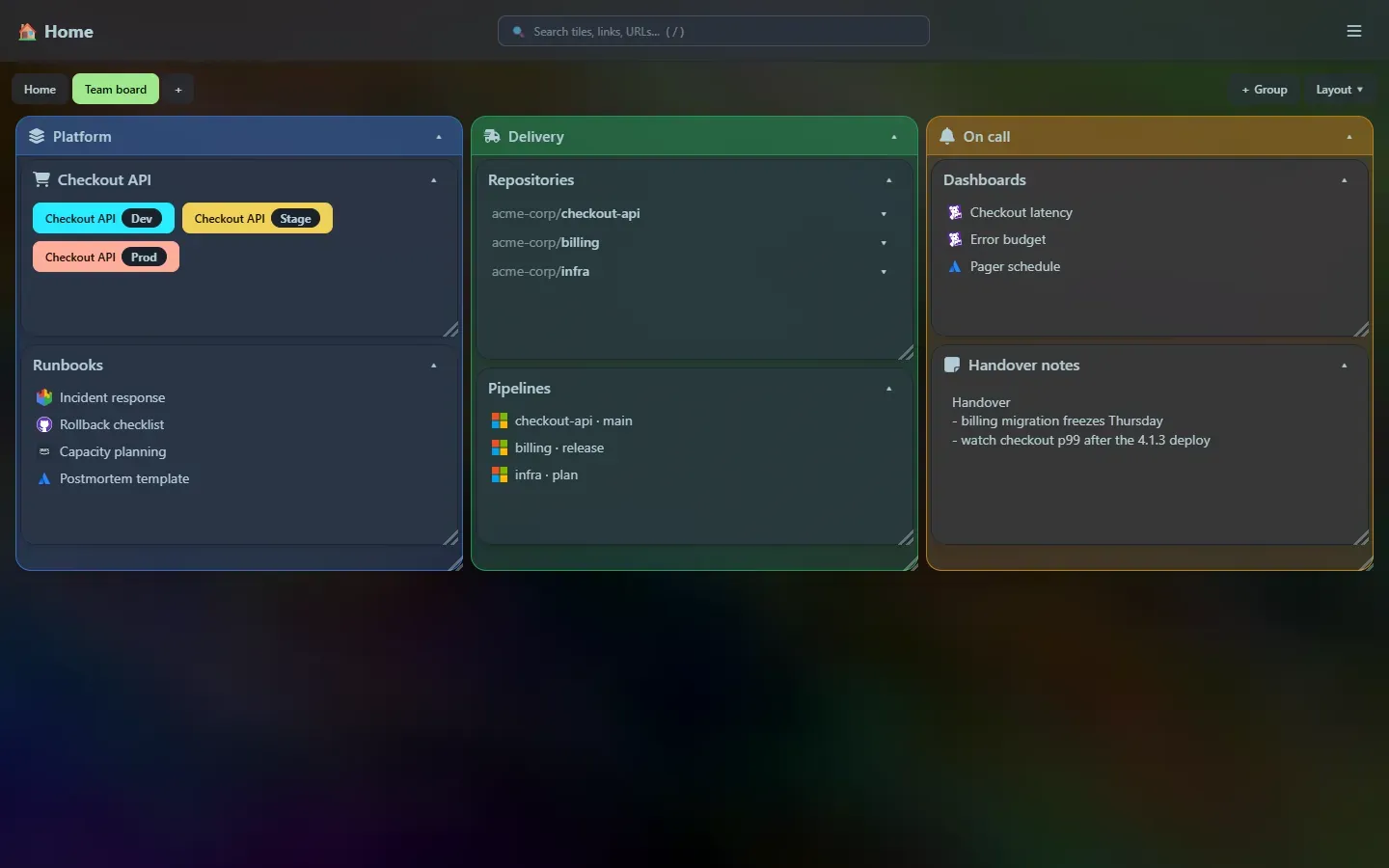
Section titled “Groups”A group is a box that holds other tiles. It moves, resizes and collapses like any tile, and everything inside travels with it. Use groups to keep related tiles together: all the tiles for one product, one team, or one part of your day.
Make one
Section titled “Make one”- + Group above the grid (next to + Add tile), ☰ → + Add group, or
> Add groupin the launcher. - Give it a title, pick a colour and, if you like, an icon.
- Add tiles to it with the + button that appears on the group’s title bar, or choose the group in a tile’s Inside group list when you add or edit the tile.
Move tiles in and out
Section titled “Move tiles in and out”Drag a tile’s title bar over a group and a dashed outline shows where it will land. Let go to drop it in. Drag it back onto the page to take it out. You can also use the Page and Inside group lists in the tile editor, which is handy on a touch screen.
How a group lays out its tiles
Section titled “How a group lays out its tiles”- A group has its own grid, as many columns wide as the group itself. A group six columns wide holds tiles up to six columns wide, and a tile that is wider than the group is narrowed to fit.
- Tiles inside are moved, resized and pushed around in exactly the same way as on the page. See Layout.
- A group grows to contain its tiles and never shrinks below them. If you want it smaller, shrink or move the tiles first.
- Collapsing a group hides everything inside it and leaves just the title bar. Opening it again restores the arrangement.
- Groups go one level deep: a group cannot sit inside another group.
- Search looks inside groups. A group that holds a match opens up and highlights it, and the launcher finds tiles inside groups, telling you which group they are in.
Deleting a group
Section titled “Deleting a group”Deleting a group deletes the tiles inside it too. Home Screen tells you how many before it asks you to confirm. To keep the tiles, drag them out onto the page first.
Colours
Section titled “Colours”Every tile, and every group, can have a colour. Choose it in the tile editor from a palette of eleven (red, orange, amber, lime, green, teal, cyan, blue, violet, pink and slate), or pick the crossed-out circle for no colour.
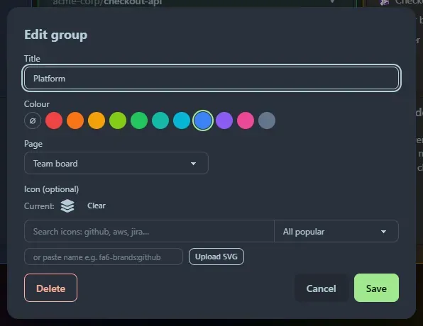
- A coloured tile gets a tinted title bar and border. The inside stays the normal tile colour, so text is easy to read on any background.
- A coloured group is a tinted box, so a coloured group stands out from a plain one at a glance.
- Colour is separate from the red Prod button on developer tiles: that is always red.
The palette is tuned to sit well on the dim theme. If you want a single, unmistakable accent, blue and amber work well against most backgrounds.
Editing without the clutter
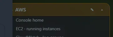
Section titled “Editing without the clutter”The ✎ edit button, and a group’s + button, stay out of the way until you point at the title bar. The ▾ collapse button is always visible. On touch screens, where there is no pointer to hover, the buttons are always shown.
Support the project: Buy Me a Coffee or GitHub Sponsors.